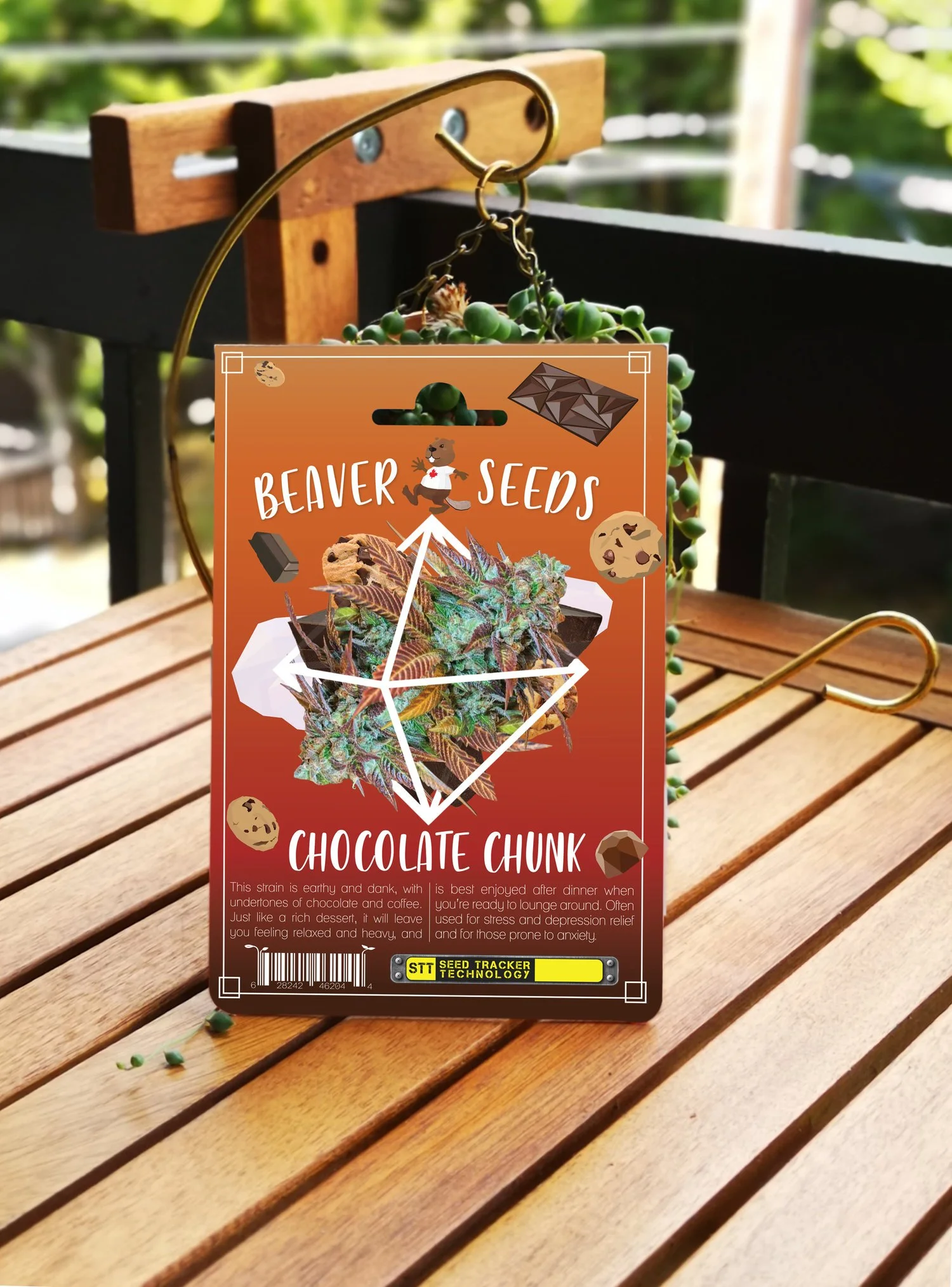
BEAVER SEEDS
CLIENT
Beaver Seeds - a Canadian cannabis seed company
CATAGORY
Rebrand & Packaging Design
BRIEF
Bright, colourful packaging that will draw the eye.
Keywords: happy, playful, unique
CHALLENGES
Any changes to the logo must fit the original plastic clamshell that fit over the first logo. This meant the beaver logo couldn’t change shape, just the design. Owner also firm on keeping the Maple Leaf t-shirt.
STRATEGY
Create a recognizable and unique style to unite all the pieces - a bright gradient for all backgrounds, and low-poly art to bring a sense of nostalgia to the packaging. This allowed me to develop a new, more adult logo without changing the silhouette.